Wedding Inspiration | Pure Elegance at The Ground of Alexandria: Dani + Stamati
When Dani asked me to design her wedding stationery I was so excited. I was worked with Dani when she first got engaged and I offered to create her wedding stationery at the time because I knew that Dani’s vision for her wedding would be something I would absolutely love creating and I really wanted to her in anyway I could.
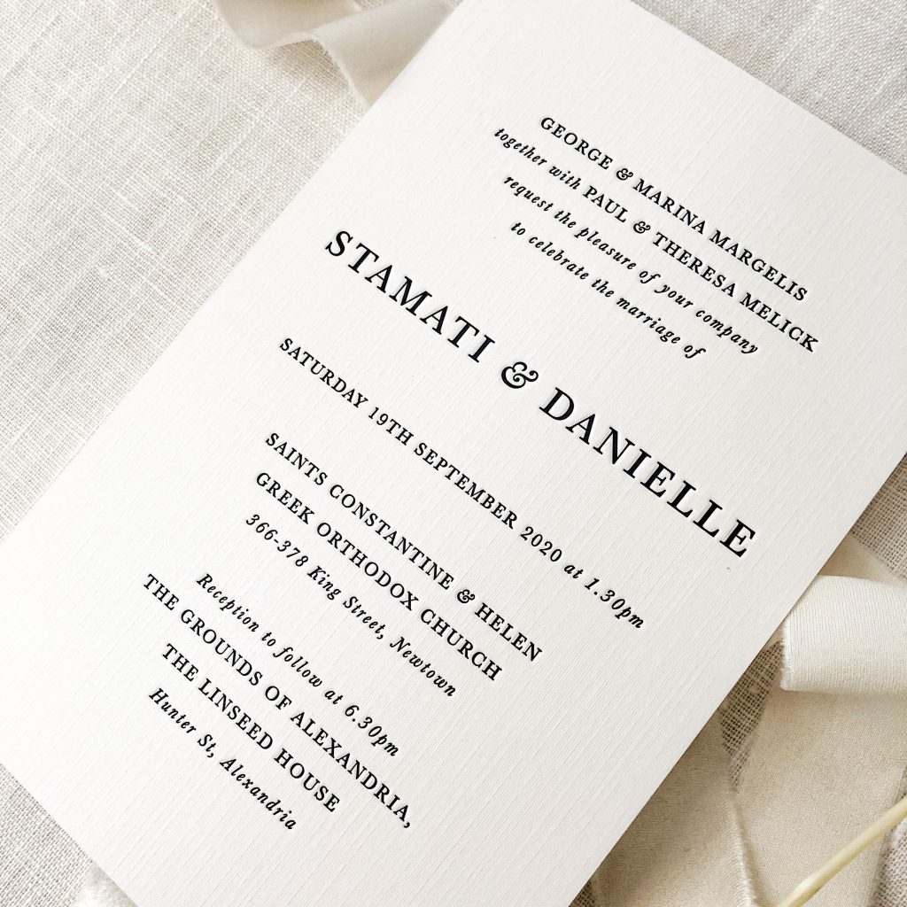
Dani knew she wanted dusty pinks, ivory and texture. Linen letterpress was one of the first things she said to me when we first started talking about her wedding invitations and that’s exactly what she ended up going with.
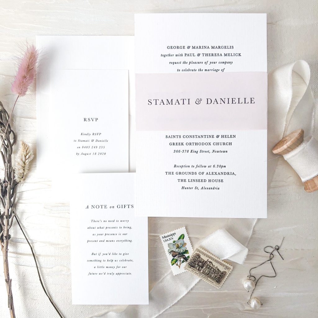
For the invitations Dani selected a gorgeous Versa Linen Brilliant White 540gsm card with letterpress. We went with a grey ink for the text to soften the card a little further and it was a great idea.

The invitation was part of a suite that also included info cards that outlined RSVP information and a note on gifts and the whole suite was tied together with a pale pink belly band.

The printed envelopes where the same Versa Linen card as the main invitations.
One of the elements I loved most about this suite was the mixing of fonts (uppercase and lowercase italic) and the beautiful decorative ampersands in the text. This brought something a little unique and interesting to the design while maintaining that sense of elegance.
The reception was held at the stunning Linseed House at The Grounds of Alexandria – and this is seriously a breathtaking venue. Super high ceilings with a gorgeous rustic elegance vibe. This venue has only just recently opened and I would recommend it for couples looking for a reception location, it’s central in Sydney, which makes it easy to access and it’s honestly so breathtakingly beautiful.
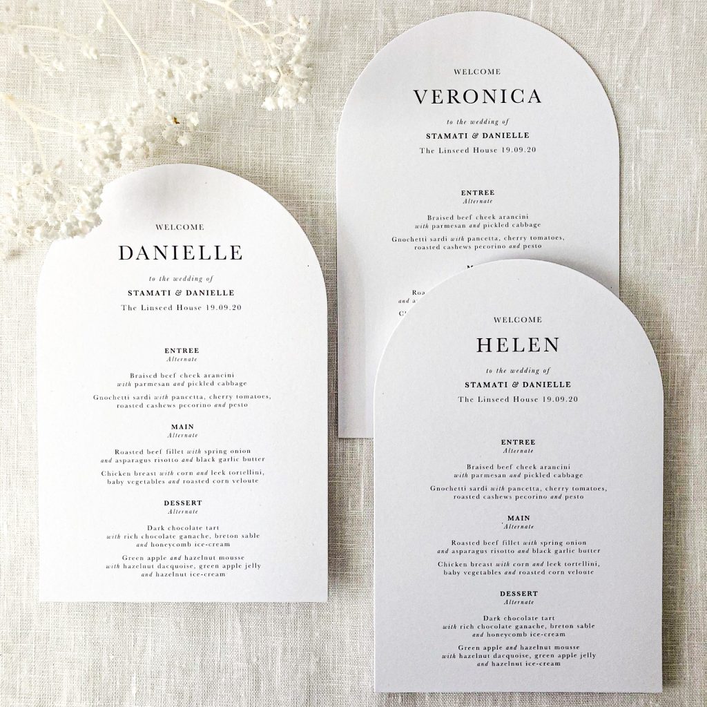
The venue provided a decent amount of on-the-day stationery including the table numbers and seating chart, however Dani and I worked together again on the menus which doubled as place cards.
We opted for an arch top diecut which matched the beautiful big arch windows of the venue absolutely perfectly.

The menus carried over the mixing of font styles (uppercase, normal and italic) from the invitations and we opted for a centre alignment to match the invitation suite perfectly.
Having these cards double as menu and place cards is really clever and grabs people’s eye. So many people actually went to the effort of taking these menus home with them because their name was on it. While die cuts can add a little onto the price of your menus, by combining the place cards and the menu, ultimately you’re coming out even in terms of price or even a little cheaper if you end up not selecting a die cut like we did here.
To wrap up, a huge congratulations to my beautiful friend Dani and her sweetheart, Stamati. What a beautiful wedding! I wish you both all the very best.
